Day 9
Jun 16, 2017 · 854 words
In Day 4’s post I talked about median absolute deviations and their relationship to estimate population standard deviation. It’s a start, but its not a great way to detect anomalies. It’s a bit too static.
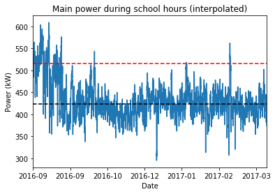
To illustrate this, here’s a plot of the Main power entries from yesterday’s filter. I ran the calculations of median, MAD and $\hat{\sigma}$.
The black line is at the sample median, and the red line is $3\hat{\sigma}$ above that. Previously, I stated that those values that surpass $median+3\hat{\sigma}$ should be flagged as anomalies.
If you look at the graph however, it seems like this is ignoring a lot of details. A horizontal line is too broad for a pool of data this large. The sample plot doesn’t naturally stay flat; it has patterns of bumps and dips throughout the months.
Rolling windows
In the stock market, a common indicator of the changing trend of data is the moving average. This measures the average value of something over a set window size. Whereas a regular average looks at the entire sample, a moving average might look at only the past 20 values in the sample. If you take this windowed average at each point, you get a plot that follows the overall trend of the data but with less volatility. The smoothness of the plot increases as the window size increases (approaching a flat line when the window size equals the sample size).
Because we are assuming that there are anomalies in our data, I’m going to stick with using the median instead of the mean. So instead of moving averages, I’m looking at moving medians. Likewise, I can calculate a rolling MAD value and use that to detect local anomalies.
Return of the gaps
Now’s the time where I’m starting to feel the downside of having gaps in the data. There’s two ways I can approach the rolling window.
First, I could set my window by timespan. Pandas calls this the offset. The problem with this is I’m looking at filtered data. When I tell pandas to look at windows that are ‘1-day’ sized, it will start from the start date and move forward by one day until it reaches the end date. It doesn’t care what filters I may have on the data. Thus it will include windows during weekends, vacation, etc. This makes the rolling plot appear disjointed and jittery.
The other option is to set the window by data count. For example, telling pandas to look at the last 30 data points. For this method I could take two approaches:
I could remove all missing entries and go from there, however the data density is not consistent. Depending on where you are in the data, 30 points could represent 7 hours or it could mean 15 hours. That would make the rolling window inconsistent.
Alternatively, you could use the past 30 points included the blank entries. This would dilute the median calculation in some areas, but would keep the window interval consistent. This assumes data is being recorded consistently. As I understand, the data is being written at 15 minute intervals (regardless of whether that records a real value or Nan). This sounds like the best option to me.
The other problem with gaps is that they can’t be plotted properly, and they make pandas throw a fit with window calculations. One solution is to use the interpolate() function to let pandas fill in the gaps with a midpoint value. That’s perfect for plotting since visually I’m happy with a midpoint placeholder.
I can’t use that strategy for the calculations though. Interpolated values don’t appear to affect the median of a sample, but they do affect the MAD. Instead, I can use the rolling min_periods parameter to set the minimum number of non-Nan values that are acceptable in my window. I don’t think there’s any harm in just setting this value to 1 since I’m not aware of any massive gaps in the data. The median and MAD are not affected by adding in random Nan values so I think this is valid.
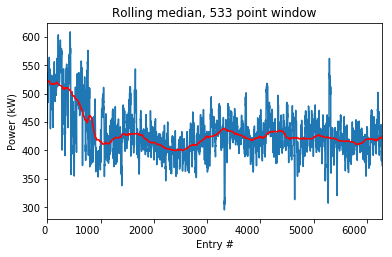
I’ll take a break from babbling to show you a picture. I interpolated the missing values to show you the plot of the sample data points (I did that on the first image too). Then I took a rolling median with min_periods=1 and window=533.
I got 533 because there are 4 data points per hour. There are 6 hours, 40 minutes in a standard school day, or $\frac{20}{3}$ hours. There are 5 school days in a week and 4 weeks in a month. That comes out to $4 \cdot \frac{20}{3} \cdot 5 \cdot 4 \approx 533$ data points in a month. So the red line should follow a month-wide trend. The x-axis is set to data count rather than date because otherwise pandas makes large gaps during vacation times. I’m working on figuring out how to keep the plot as it is but change the axis label to show the dates, even if the spacing isn’t consistent.
Next week I will work on the rolling MAD and using that to track local anomalies.

