Day 39
Jul 31, 2017 · 911 words
Last time I noted that the variance in the power vs. temperature residuals fanned out quite a bit at higher temperature values. I’m curious if other data sets behave similarly. One thing to consider: is the changing variance truly an issue of randomness, or is there another variable at play here? The more variables you consider, the less you leave up to chance.
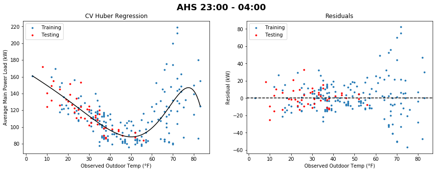
Previously I was looking at the school-time data, but you can see the same fanning occuring in the night data (where there is also an annoying flare on the right):
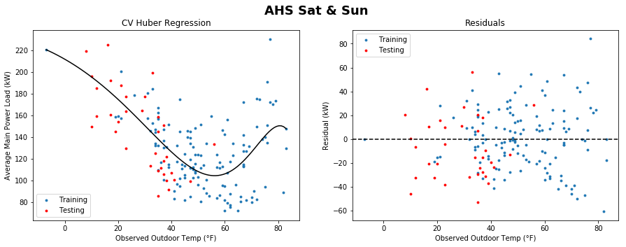
However, the fanning is much less pronounced in the weekend data:
By comparison, here is the weekend data plot for Bancroft:
The difference in model shapes is striking between AHS and Bancroft. Relative to the size of its overall load, Bancroft shows much less change in power load across temperatures than AHS. The regression plot is almost a flat line. Note that the Bancroft load values are significantly larger than those for AHS though, so the actual amount of explained variance for Bancroft is larger than it seems.
Alas, the score for the above Bancroft plot is incredibly poor (it is negative) which is odd because it looks to be doing a decent job. The score method that I’m using here finds the $R^2$ coefficient, and a negative value there means that the model is supposedly performing worse than just a line through the mean (on the test points at least).
Today’s distractions
Today I spent some time learning more about how kernel functions and Support Vector Machines work. It sounds like SVMs are more commonly used for classification problems, but they can be implemented for regression too. Letting a kernel figure out the implicit shape of my data sounds more elegant than having me arbitrarily pick a maximum number of polynomial features to look for.
Here’s a visualization of how the kernel trick works for classification (which I may use later on for classifying load profiles):
Research papers
Energy Consumption Forecasting for Smart Meters
Anomaly detection for visual analytics of power consumption data
Early-warning application for real-time detection of energy consumption anomalies in buildings
The papers hosted on ScienceDirect I was able to access after logging in through the UMass libraries website. The second article looks particularly promising.
I’m going to need some time to read and digest all the information avaliable here. I’ll jot down what sticks out to me.
Anomaly detection for visual analytics of power consumption data
One approach this paper mentions is weighted predictions, where recent samples have a stronger influence on future predictions than older samples. This would be helpful because it makes the prediction more dynamic as the building undergoes changes in usage.
The actual predictive approach this takes is somewhat basic - they stratify historical data by time of day and day of the week and take the average of each pool to create a bank of expected values. That is, it assumes each time of day will behave the same way it did last week and weeks before. To score values by their abnormality, they use the ratio of the difference between an observed and expected value to the average of all such differences for the data.
The second approach is not as clearly explained, but it tracks what power load patterns are most common and ranks days by how similar they are to the frequently-occuring patterns. This doesn’t explicitly account for variables like temperature, but since it looks for pattern similarity it accounts for a varying load profile for buildings with complex schedules (such as a school where you have weekend patterns, snow day patterns, school day patterns, etc.)
The rest of the paper is focused on the effectiveness of a variety of visualization techniques, such as dynamic blurring and interval/ratio color palettes.
Early-warning application for real-time detection of energy consumption anomalies in buildings
This paper aims to create a user friendly realtime system of anomaly detection and monitoring. The visualizations included in the paper look really good. They are clean and simple, showing a plot of predicted usage versus the actual day’s usage. The predictions are saved from the week before and they are calculated using a method described in a different paper, which is a hybrid of a modified Support Vector Regression algorithm and a Seasonal ARIMA algorithm.
It’s unfortunate that the former paper doesn’t go a little deeper into its prediction technique, as the latter paper is a bit too dense to skim over.
Energy Consumption Forecasting for Smart Meters
The technique used in this paper is Boosted Decision Tree Regression. It is an example of an ensemble method, which is a method that combines the results of a number of base estimators to get a more generalized prediction. The paper is quite readable.
There’s a lot to unpack here and many different approaches to our problem. It’ll be tough to narrow down the best option. On the bright side I think I’m reaching the light at the end of the tunnel where I’ve seen most of what these machine learning libraries have to offer (even if I don’t completely understand what they all do yet) so at least the constant train of discoveries should slow down. I’ll read more into each author’s argument for their model and hopefully come up with a “best” approach in the near future. Scikit-learn makes it easy to do the code, but picking the best technique is really tough.


