Day 33
Jul 21, 2017 · 471 words
Polynomial regression as linear regression
There is no specific polynomial regression estimator in sklearn. Zico Kolter goes over this in his lecture, but polynomial regression is really an extension of linear regression because the additional feature terms ($x^2$, $x^3$, … $x^n$) can be thought of as regular variables with linear coefficients. Scikit-learn has you making a PolynomialFeatures object of a particular degree, then using its fit_transform method to generate the feature matrix.
import numpy as np
import matplotlib.pyplot as plt
from sklearn.preprocessing import PolynomialFeatures
from sklearn import linear_model

X = np.sort(5 * np.random.rand(40, 1), axis=0)
y = np.sin(X).ravel()
x_plot = np.linspace(X.min(),X.max(),100).reshape(-1, 1)
poly = PolynomialFeatures(degree=5)

X_ = poly.fit_transform(X)
x_plot_ = poly.fit_transform(x_plot)

reg = linear_model.LinearRegression()
reg.fit(X_,y)

plt.scatter(X,y)
plt.plot(x_plot, reg.predict(x_plot_))
That example fits a 5th degree polynomial to a sinusoidal sample.
More Dimensions
I know how to perform a regression on one-dimensional input, but it would be cool to try adding a dimension. There’s no real extra coding involved (other than passing in an array of $x_i \in \mathbb{R}^n$ as opposed to $x_i \in \mathbb{R}^1$) but the hard part is actually showing the results…
3D Visualization
I’m using this resource to try out 3D plotting in Matplotlib. I’m going to start by just making a scatterplot of the data, looking both at the observed temperature for each point’s day and the number of minutes since midnight:
It’s hard to see here, but it should form a tilted saddle shape.
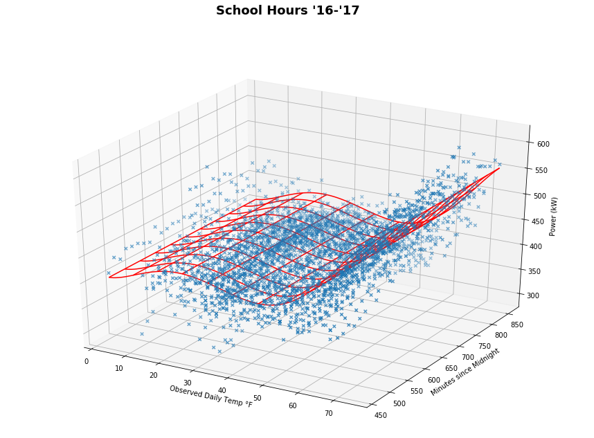
I got this far with the regression plot, but it’s definitely not right; it’s not accounting for changes in the y-axis. I’ve verified that the regression is working when changing the y variable, but I’m doing something wrong with the plotting process.
Fixed!
I finally got the plot to display correctly. I don’t entirely understand how it works since I’m unfamiliar with the specifics of the
numpy.meshgrid() and Axes3D.plot_wireframe() methods. This post helped me figure out how to organize my Z-array. Visualization is not the most important part of this project so I suppose it’s not a big deal if I do a hack-job on the plotting scripts.
Anyways, you can see the saddle shape now. The red surface represents a least squares regression on 5th degree polynomial features of the data. I can now take a theoretical temperature and time input (and convert that to minutes since midnight) and return an estimated power usage. I could do this for as many input variables as I wanted now, but I wouldn’t be able to really visualize that nicely (I had a hard enough time plotting in 3D). Pretty cool!
To do
I’m still using a basic linear regression technique for the estimator. I’m fine with using a polynomial for now, but I might want to look at other loss function options (e.g. LassoCV is a regularized linear estimator that has cross validation built in)


