Day 31
Jul 19, 2017 · 543 words
Continuing with the lectures
I skimmed over the 4th and 5th lectures, as they started getting into more specific linear algebra topics that I can delve into later if necessary.
Lecure 6 discussed how you can take the concept of minimizing the cost function using linear features and simply add in non-linear features to fit a model more closely to non-linear data.
Prof. Kolter showed two main approaches here. The first is adding polynomial terms to the feature vector, and the other is using a number of Radial Basis Functions (RBFs). More specifically he demonstrates the usage of a Gaussian RBF, which functions a lot like a normal curve. With enough of these RBFs you can mold them to minimize the cost function on your sample.
Some issues he mentions are that these methods can be computationally demanding, especially when dealing with multi-dimensional input. Additionally, you have to be careful when setting up your feature vector to avoid over/under fitting the model to your data.
To remedy the latter issue, he explains the process of regularization, which incorporates the size of the model parameters (relative to a constant $\lambda$) in the cost function so that features are discouraged from overfitting.
The last topic he discusses is kernels, which through mathematical sorcery that he derives allow you to optimize the cost function using an arbitrarily high (or even infinite) dimension feature vector without ever explicity defining that feature vector, making it a much more efficient process.
Trying out some code
As I mentioned yesterday, the course uses MATLAB. Numpy and SciPy are the primary Python libraries that accomplish similar goals. Since these libraries are designed for scientific analysis, most of the regression techniques are probably already included in these libraries (but it’s still beneficial to know the theory behind how they work).
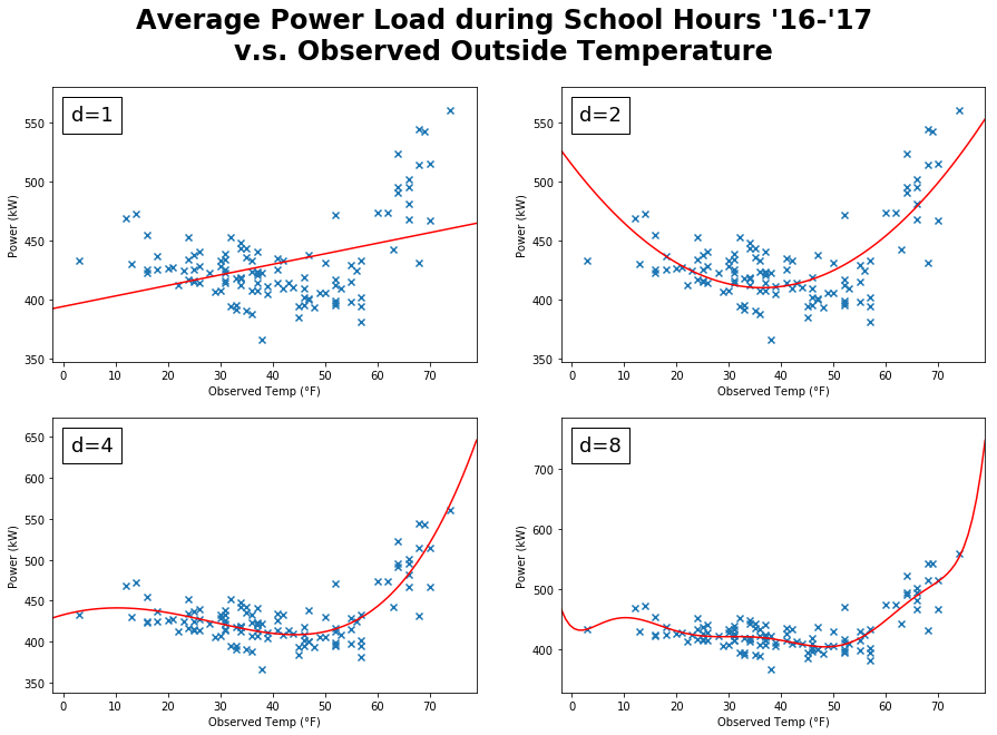
Since the lecture video looks at a plot of power vs temperature, I will do the same with our own data. Note that the video compares maximum power load to maximum temperature because in that context the concern is power distribution, but I’m not concerned with the maximum power load as much as an overall indicator of the power usage. I’m going to look at the average power usage for each day during school hours versus the observed temperature for that day.
Numpy has a polyfit function that will perform a least squares regression using polynomial features. Here are a few plots showing the fitted polynomial regressions of varying degrees:
I was inspired by the lectures to use x’s instead of dots for my plot markers for better visibility.
I’m using NumPy’s poly1d objects to plot the polynomial model. Given an input value, they’ll return the expected response.
The plots for degrees 3 through 5 look the best, the others are either underfitted or overfitted. What stands out about the $d=5$ model is that it approaches $+\infty$ at both edges, which is nice because you would expect a trend of higher power usage at both temperature extremes. From this example alone, polynomials seem to do the job just fine. Perhaps other variables won’t share such a nice relationship though.
Tomorrow I’m going to look at other relationships and see if it would be a good idea to use a kernel regression method.
