Day 27
Jul 13, 2017 · 624 words
This morning I joined Anil on a guided tour of Andover High School. He pointed out key parts of the electric and heating framework for the building. Starting with the main power switch and working down to the sub-panels distributed throughout the school it became easier to visualize the tree structure of the circuitry. It also became appart how challenging it is to navigate the electrical map, so it’s good that the other team(s) are working on improving this.
Later on Anil will show me more about the structure of the building’s heating and ventilation system. Also soon he will be providing our team with more data samples which will be really helpful for branching out our expectations for power usage, and it will allow us to test the usefulness of what has been done so far.
Back to the code
I moved the work from yesterday into a function and tweaked some labels:
"""
adjust_sample: Series *int --> Series
returns an adjusted version of the data that approximately follows the
energize fitted lognormal distribution

Buffer count (for setting the quantiles) defaults to 1 on each side (to take
the place of the 0th and 100th percentiles) and can optionally be changed
"""

def adjust_sample(series, buffer=1):
    fit_params = lognorm_params(series)
    s_sorted = series.sort_values()
    q_step = 1/(series.size+2*buffer-1)
    q_array = np.linspace(buffer*q_step, 1-buffer*q_step, series.size)
    quantiles=pd.Series(q_array, s_sorted.index).sort_index()
    return pd.Series(stats.lognorm.ppf(quantiles,*fit_params),
                 quantiles.index)
I’ve been playing around with this and have found some areas where it succeeds, and plenty of areas where it has some trouble.
Here’s a few subplots of the adjustments running on subsets of the weekend data:
The Lighting plot looks good and shows a solid 6.85% improvement. The Main and Plug load show a nice improvement but it’s questionable how realistic the fit is. The Gym plot is a different story. The fit is not able to keep up with the crazy looking data sample. The histogram looks just as raggedy as the KDE suggests. I think the model makes a decent effort, but by smoothing out all the spikes in the data it ends up using more energy that the sample did. To be fair, the data is more of a problem here than the model is.
The night data doesn’t look too bad:
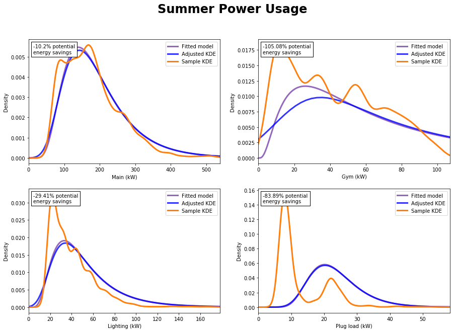
But the summer data is a nightmare:
Again, the problem is really with the data itself. We’re assuming a log-normal distribution, and the summer samples don’t seem to be following any sort of traditional distribution. Why the erratic data?
Either there really is some ridiculous randomness going on in the data, or there are underlying variables causing the distortion of the distribution. I’m thinking that for this reason the Poisson regression method will allow us to better refine our distributions to rule out as many variables as possible.
But for samples that do follow a relatively lognormal distribution, this seems to be doing a good job of filtering out the abnormalities and yielding reasonable savings values.
You may notice that the blue adjusted KDE doesn’t always follow the the purple fitted distribution. It even looks like the adjusted value distribution extends below 0 kW in some subplots. I looked into it, and it’s an issue with the way a KDE plot is calculated. if you plot the histogram it follows the model more closely.
Random side note: while I was tweaking the buffer value, I realized it may be easier to let the user specify a buffer percentage rather than count? (e.g. a buffer that excludes 2% of the model values on either tail). Note that depending on the sample size this may cause issues with the fit of the adjusted sample.
Tomorrow I’ll be meeting with the group and Anil so we can reconvene and get some more data to work with.


