Day 25
Jul 11, 2017 · 503 words
Plotting the Quartiles
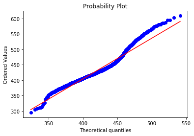
scipy.stats.probplot is a method for comparing data quantiles to a distribution.
stats.probplot(school_main,egz.lognorm_params(school_main),'lognorm', plot=plt)
For some reason even if I set fit=False it still shows the regression line. This visual doesn’t interest me too much because I can’t see the actual percentage values, I’d rather have a plot comparing the percentile ranks
I can see this happening two ways:
- a range of quantiles (for the sample) compared to the expected CDF of their corresponding values
- a range of quantiles (for the model) compared to the sample
percentileofscoreof their values (using the model PPF)
On Day 23 we used an instance of the latter option.
I tried both and I definitely like the latter choice better. Theoretically our model would be fixed and the sample data is what varies, so it would make sense to have the sample be on the y-axis. This way also shows you visually where the sample data is surpassing the expected model.
It’s actually easier to use method #1 and then just flip the axes because otherwise you have to set a really small increment for the x-axis in order to see anything interesting
Here’e a readable version of what’s going on:
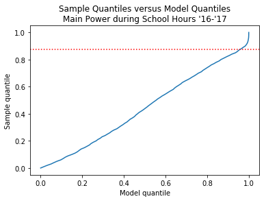
sample_quantiles = np.arange(0,1,0.01)
quantile_vals = school_main.quantile(sample_quantiles)
fit_quantiles = stats.lognorm.cdf(quantile_vals,*fit_params)
If you look at yesterday’s plot of the sample and fitted densities, you can see that they start to deviate at 475 kW. That corresponds to the 87.3 percentile of the sample data (marked by the red dotten line above), which is right where the upward flare begins.
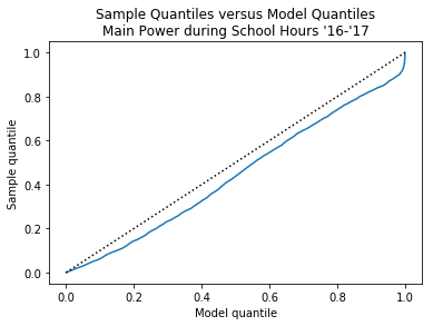
Here I added a straight reference line to show the ideal quantile relationship. You can see that for the entire quantile span, the sample data falls below the model. By definition, quantiles deal with the data below their rank, so the implication of the sample quantiles being consistently lower than the model is that the region above those markers is consistently higher (which is bad).
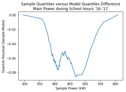
I don’t know if a flare in the Q-Q plot will always translate into an intersection of the density plots. In the case I visualized above, the flare represents a rapid compensation for quartile spread in the sample values; a large portion of the sample (big $\Delta y$) is contained in a small portion of the model (small $\Delta x$). You can make this shape more visibile by plotting the difference between the sample and model quantiles like so:
The plot reaches a local extrema at 475 kW, after which it needs to rapidly compensate to bring the difference back to zero.
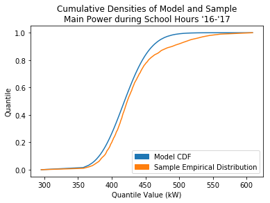
Here’s the two plots that this is taking the difference of:
Overall it seems like the extrema of the quantile residuals sort of indicate key areas for the distributions, but considering that the quantiles of the model and sample aren’t supposed to line up I’m unsure if the ambiguousness is good or bad. If I just want to find the points were they intersect I’m better off just looking at the residuals of the density functions at each power value.
