Day 24
Jul 10, 2017 · 1105 words
Improving the maximization
Last time I mentioned how I wanted to find a better way to find the peak of the Kernel Density Estimation. Previously we were evaluating the KDE probability at 10,000 sample points within the region and letting Pandas find the max of that set. I wanted to see if there was a more direct, precise way to do this.
Numpy has a gradient function for calculating partial derivatives, but it only applies to arrays of sample points. That wouldn’t really be any more precise than our current method since it depends on the resolution of the sample data.
SciPy has an optimize module that lets you perform a minimize_scalar algorithm on a sample. It still bothers me that this seems to be running an approximation algorithm rather than exact mathematical calculations. I’ll keep my eyes out for any other libraries that can do better.
Note: perhaps this could be solved by manually calculating the KDE to get the exact probability density function (rather than whatever method object SciPy returns) and combine that with SymPy to calculate the derivative?
Nonetheless, this is probably more efficient than the maximum approximation that we were using before. You may be wondering why I specified the minimize_scalar function as opposed to a maximization function. SciPy only includes optimization for minimizing functions, so to “maximize” you simply minimize the function with its sign reversed.
Abstraction
"""
lognorm_params: Series --> ( float, float, float )
Returns the shape, loc, and scale of the lognormal distribution of the sample data
"""

def lognorm_params(series):
    # resolve issues with taking the log of zero
    np.seterr(divide='ignore')
    log_data = np.log(series)
    np.seterr(divide='warn')
    log_data[np.isneginf(log_data)] = 0

    kde = stats.gaussian_kde(log_data)
    est_std = mad(log_data)*1.4826
    est_mu = optimize.minimize_scalar(lambda x: -1*kde.pdf(x)[0],
                                  method='bounded',
                                  bounds=(log_data.min(),log_data.max())).x
    return (est_std, 0, math.exp(est_mu))
The first few lines of the function are there so that there’s no issue if the sample data contains zeroes. Usually numpy will give you a warning and fill the offending results with -inf. These first lines temporarily disable that warning and replace the -inf values with zeros.
Then I calculate the estimated standard deviation of the log sample using the scaled MAD value. Next is the estimated population mean. In the minimize_scalar call, the first argument is a function that evaluates the negative PDF at a point (so that we’re really maximizing this PDF). The guassian_kde.pdf() function returns an array even if you only pass in one value, so I needed to extract the first value of the return array to get the actual scalar.
I had an issue using the default method for minimize_scalar where it would always return zero, so I changed it to the 'bounded' method which let me specify which region to try to optimize. After changing this it was able to optimize properly. For now I’m just setting the bounds to be the range of the log sample values, but if efficiency really becomes an issue we could even narrow that down. Lastly note the .x on the end of the call. That’s because the method returns an object with many properties, and the x property contains the actual solution.
I return a tuple containing the shape, location, and scale values of the lognormal distribution. According to this page (and verified on Wikipedia), the shape attribute of a lognormal distribution is the estimated standard deviation of the normal distribution of the log values. The location property translates the distribution along the x-axis, and I’ve been advised to force that to zero. That makes sense since the whole point of using the lognormal distribution was to fix our lower bound at zero, and translation would disrupt that. The scale is defined as $e^{\mu}$.
Those are the parameters that SciPy interprets natively for the stats.lognorm distribution functions, so you would just have to unpack the resulting tuple of this function when passing it to a SciPy log-normal function.
Example usage:
Let’s say we want to plot the distribution:
x = np.linspace(school_main.min(),school_main.max(),100)
params = egz.lognorm_params(school_main)
plt.plot(x,stats.lognorm.pdf(x,*params))
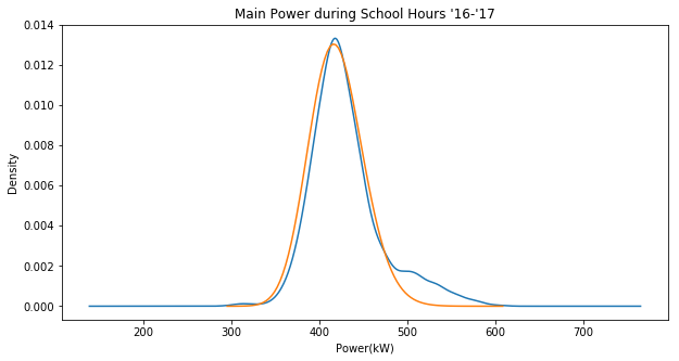
Here’s a plot of the fitted distribution (orange) against the sample KDE (blue):
Note that this unlike yesterday this is actually plotting the lognormal distribution as opposed to the normal distribution of the log values.
Likelihood Function
The SciPy fit() function tries to maximize the likelihood of a distribution function when picking its parameters, who I’m curious how the likelihood of our fitted distribution function compares to that of the one that SciPy picks.
But first, I want to make sure I really understand what the likelihood represents. This post does a nice job of explaining what it represents both in discrete and continuous contexts. Basically, likelihood operates sort of opposite to probability. Where probability asserts the parameters ahead of time and quantifies the chances of getting a certain outcome, likelihood asserts the outcomes first and quantifies the chances of them coming from a certain set of parameters.
A likelihood is calculated as the joint density of the observations given the parameters.
The Problem: Really Small Numbers
The probability density of a given value occuring is already really small, as in less than 1. Looking at the graph above, the density never even exceeds 0.014. Remember than when you take a joint probability of such events, the probability is only going to keep going down. Taking the product of 3,000+ such values yields a miniscule result. Python doesn’t even have the resources to keep track of events this small. It runs out of decimal places and rounds it out to zero everytime.
If I wanted I could probably look into a way to counteract this (one idea I saw mentioned was to use log values or the mpmath package) but I should ask myself, is it really worth it?
As far as I’m aware there is no straightforward way to even interpret the likelihood of a sample, since the value can change drastically depending on how many sample values you have. It seems to be just a tool used to find optimal parameters. I think that a SSE may be a more reasable value for this purpose.
Comparing Quantiles
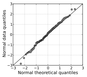
One area we played around with last time was comparing the quantiles of the sample data and fitted distribution. A more generalized approach for this is visualized in a Q-Q plot which directly plots the quartiles against each other. Ideally this would give a straight line, but since our expected fit model is not intended to line up 1:1 with our sample data it definitely won’t.
Example of a nice fitting Q-Q plot from Wikipedia:
Looking at the fit of that Q-Q plot could be another way to analyze the fit of the estimated model.

