Day 2
Jun 7, 2017 · 621 words
Now that the blog is running relatively smoothly I’m able to focus on the actual problem at hand. I started by installing the latest release of Anaconda, which I then used to install the pandas library.
Pandas in a Nutshell
The pandas library is centered around DataFrame structures and their child Series structures. A dataframe functions like an excel spreadsheed, with various columns of data matched by each row’s index. Each column can be pulled out as a series object, but a single-columned dataframe is not necessarily the same as a series object. An example of a dataframe:
| Index | Main (kW) | Gym (kW) |
|---|---|---|
| 2017-03-21 02:45:00 | 70.81228 | 10.282110 |
| 2017-03-21 03:00:00 | 76.02322 | 9.198661 |
| 2017-03-21 03:15:00 | 75.19489 | 10.011790 |
| 2017-03-21 03:30:00 | 69.43213 | 10.757050 |
Initial analysis
I used the current Metasys Parser application to download the parsed data from the 24 Hr detailed electrical period from Mar 2017 - Aug 2016 as a CSV file. This file has over 85,000 entries. Pandas is pretty quick to load it all in though:
df_energy = pd.read_csv(data_path, skipfooter=3, engine='python', index_col=0)
df_energy.index = pd.to_datetime(df_energy.index)
The skipfooter parameter is included because the last 3 lines of the parsed CSV file contain some descriptive info that is not relevant data.
By default the index starts at 0 and goes up to (n-1) entries, but since we’re dealing with a time series I set the index for the dataframe to be what used to be its first column (the time stamps). I then converted these to a date/time object format that pandas can understand.
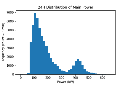
Theoretically, the energy data should follow some kind of model. That model could be used to make comparisons with to detect abnormalities. I wanted to start by getting an idea of the overall distribution of all the data. Pandas has some basic plotting features built in that work in tandem with the matplotlib library.
As you can see, the data follows a sort of bimodal distribution. The main peak seems to be an indication of the general nighttime usage (since it occurs at a lower kW value), while the much smaller peak to the right of it likely marks the daytime usage. It’s good to see that the most frequent power usage is a lower value. Ideally we would see two somewhat defined peaks, with minimal power leakage in between or around the edges.
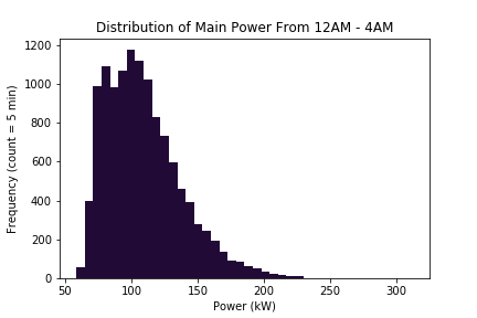
I broke this chart down a bit further to single out the power usage between the hours of 00:00 and 04:00. Since the dataframe index is stored as a datetime object, it’s pretty easy to filter out time indexes as follows:
df_night = df_energy.loc[df_energy.index.hour <= 4]
As expected, we see a similar shape here as we did from the left side of the 24 hr chart. What’s concerning here is the right skew. Not a lot of activity should be going on during these late hours, so the distribution should be pretty symmetric. The trailing values to the right of the peak suggest areas of wasted energy. The next step is to figure out where that wastage is coming from.
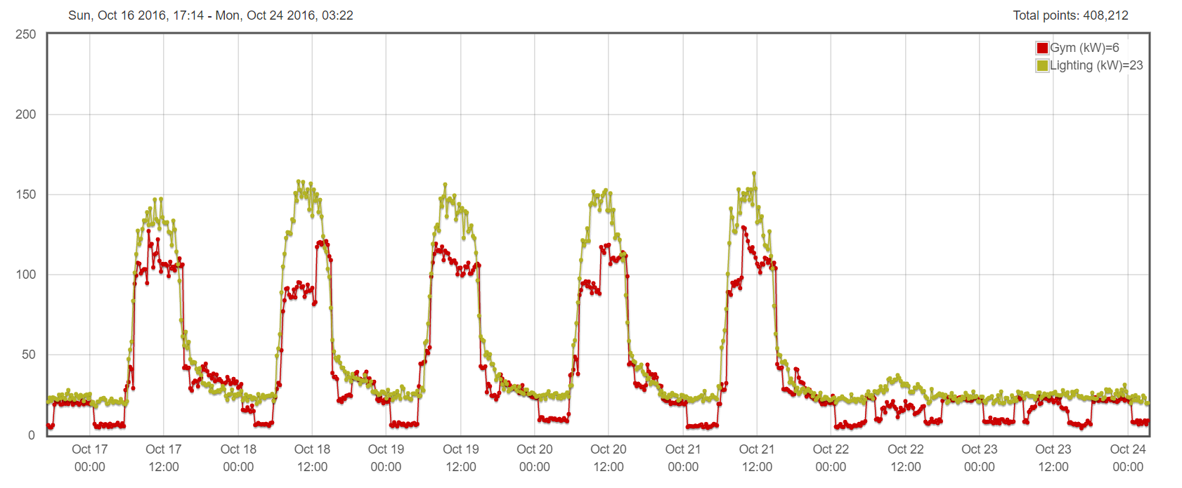
Yesterday I spent a little time looking at the plots from the EnergizeApps site. I wanted to see if I could visually spot areas of odd power usage. I picked an average sample week (from Oct 17th to 23rd, 2016) which I checked didn’t have any scheduling abnormalities.
Here’s the plot showing the usage from the lighting and gym mains.
The lighting chart is a pretty good indicator of the day/night cycle. The lighting units die down after about 3pm, but the gym doesn’t reach its minimum power usage until well past midnight. Certainly there are late night sports practices, but it seems excessive for the usage to extend that late.I’ll dig deeper tomorrow.


