Day 17
Jun 28, 2017 · 705 words
Before I get sidetracked, here’s a nice resource of statistical tests and their use cases. I also really like this site which goes into great detail on not only how to perform various statistical measures, but also situations when you should (and more importantly shouldn’t) use them.
Daily power models
I don’t want to ignore the fact that we’re dealing with time series data. Most statistical tests are based around random samples with no inherent ordering, but our data has the added factor of ordered time stamps.
You would expect a properly filtered section of the data to follow a temporal model. That is, power should be used in a similar pattern between the start and end of each day, week, month, etc. Of these I think days are the fairest way to split the data.
To visualize this, I want to split my data into its respective days, then plot the power usage at each time of day, overlaying each day on top of the other. I found a solution here
school_main_stacked = school_main.copy()
school_main_stacked.index = [school_main.index.time, school_main.index.date]
school_main_stacked = school_main_stacked.unstack()
After making a two-part index of my copy of the school data (one part time, one part date) I can use the unstack method to convert the dual-indexed series into a more organized dataframe. Note that school_main = df_school['Main (kW)'].
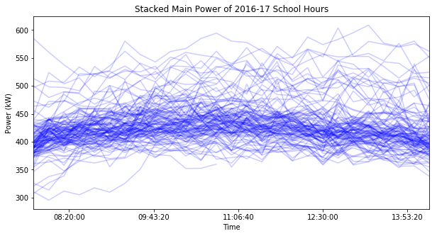
Now the index just contains the times and each column is labeled according to its date. When I plot this dataframe each column will share the same time axis, with a seperate line for each date:
I lowered the line opacity so that the darker areas signify a higher plot density. The dark areas form a smooth, broad curve that’s higher in the middle than the edges. Maybe I can calculate values for the curve and compare each day’s plot to that general model.
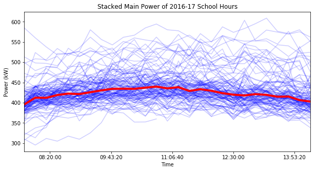
If I calculate the median at each time value, I get this median trend (shown by the red line):
I could even smooth this out some more by using a rolling window, but then the model would have a gap at the beginning (or both ends if I centered the windows).
So, what can I do with this model?
1. Flag individual points
I could take a similar approach as I took with the rolling windows last week. If you assume a normal distribution of power usage at any given time of day, you can flag points that are past $3\hat{\sigma}$ from the median trend. I should point out that a normal distribution says you can have values that high, just that it’s pretty unlikely.
2. Test the distributions
I can perform a statistical test on each slice of data (one for each time of day) to check the distribution. Maybe that’s a test for normality, maybe it’s a log-normal test, maybe something non-parametric, etc. (that can be determined later). If it fails the test, warn the user that at that time of day their power usage is abnormal.
3. Quantify power savings
This area also is subject to change based on what underlying distribution you assume, but for convienence I’ll stick with normality. I noticed that the most dense part of the plot above occurs within 1 scaled MAD (a.k.a. $\hat{\sigma}$) from the median trend:
Even when I tried the same process with the weekend data or data from lighting, plug load, etc. that was the case. Given normal distributions, this region should capture about 68% of the data points. If you wanted you could even customize what percent of the data you enclose using an invnorm function.
If you set this region as a goal you could then calculate a new optimized data set where you shift the points that are above this region down so they are enclosed. That could be done either by just setting those points equal to the top boundary of the region, or doing some kind of exponential shift (where the points that are farther away get shifted more) on the points above the median until everything fits nicely within the desired region. Then you could perform a comparison on the data sets to see how much energy (and money) you could save by calculating the difference in areas under the graphs.


