Day 16
Jun 27, 2017 · 846 words
Sample Data Makeup
So far I’ve not been very particular about what kind of data sample I’m getting. I’ve mentioned that the sampling rate is not consistent and there’s lots of empty entries but it hasn’t been a concern yet.
Now I need to pay attention to these details. I’m going to set the record straight on what the sample data looks like by asking myself two questions:
1. Where are the null entries occuring?
I know already that there are lots of blank entries in my raw energy dataframe. If entire rows are empty in a consistent pattern then this is not an issue. I can find how many entries are null in the rows by saying
num_null = df_energy.isnull().sum(axis=1)
I don’t quite understand why axis=1 is correct here, since even in the documentation is states that an axis of 1 refers to columns when it actually sums up the row values. Perhaps the logic was that for each row entry, it sums the value in every column.
From here I can see that num_null.unique() returns [6, 5, 3, 7, 1, 0]. That may be a problem, because it means that some rows are partially filled. I can understand the 6’s (at first only the ‘Main (kW)’ column has entries), and the 0’s represent full rows while the 7’s are empty columns. The other entries I was not expecting.
I can use this existing logic to index the dataframe by the number of empty values each row contains and see what timestamp is associated with the null counts. Just to be thorough I should check anything that’s not a 0 or a 7, since there could be more 6’s than I was already aware of.
df_energy[num_null.apply(lambda n: n not in [0,7]]
That gives me a dataframe of partially filled rows. The good news is, this array only has entries up until 08/04/15. That’s great because I was going to drop those first couple of days anyways (those are the days when only the Main column has entries). It’s a relief that all of the rest of the data is clear.
From now on I’ll run dropna() on my energy dataframe when I first define it.
df_energy = df_energy.dropna()
This removes all partially filled rows.
2. What are the time differences between entries?
There’s not a very clean way to do this. I can put my datetime index into a series, then use the shift() function to compare the difference between entries.
times = pd.Series(df_energy.index, index=df_energy.index )
time_diffs = times - times.shift()
Now I have a series of timedelta64 objects. An overwhelming majority of these entries are just 15 minute intervals.
It’s not convenient to work with this type of data; Pandas isn’t as forgiving with it as it is with regular datetime objects. I can’t just pull out the number of minutes for each entry. However, time_diffs.min() corresponds to a 15-minute time difference object. All I want are entries that differ from this, and since this is already the minimum time difference that means all that’s left is values higher than 15 minutes.
I can say time_diffs[time_diffs > time_diffs.min()] to get the entries that have larger gaps than 15 minutes. This comes out to only 7 entries, and they’re spread out thoughout the whole data set. Compared to the tens of thousands of overall entries, these shouldn’t be of concern. The largest gap that occured was on June 7th, when the system didn’t record for 1d 9hr 15min. Besides that, there were a couple of 1hr 15min gaps then four 30min gaps. I don’t see these gaps having a significant effect on the analysis results. If there was a greater presence of gaps I would have to consider weighing each data point accoring to the timespan it represents.
Getting more familiar with the distributions
In order to determine which statistical test is best suited for our power data, I think I need to spend some more time looking at the distributions of different breakdowns of our sample data. On [Day 13](https://energize.mattrossman.com/post/day-13/ I found a nearly normal distribution when looking at the intra-day data filtered during school hours. I will now look at the density functions of other strata.
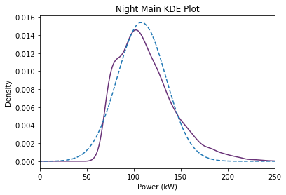
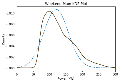
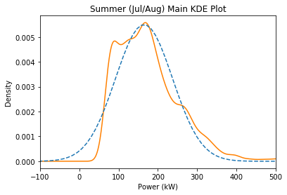
Here are a few Kernel Density Estimate plots of subsets of the data with a dotted estimated normal curve overlay (using the median and scaled MAD value):
Far from perfect. The night and summer plots look pretty good but the weekend plot is quite off. Currently I’m making these judgements off intuition. It feels like the estimation plots should wrap more tightly around the left side, especially since our goal is reducing power usage.
Log-Normal Distributions
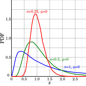
Oftentimes when a parameter has a lower bound it follows a log-normal distribution. This is when the natural log of the values follow a normal distribution. This creates a right skew in the expected models:
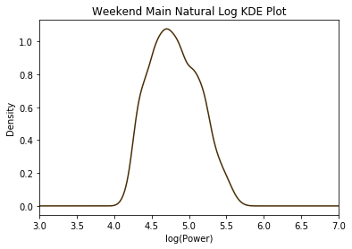
For example, here is the natural log adjusted distribution of the weekend data:
It’s looks more symmetric than the original plot, and this could be a viable model because of our inherent lower bound of zero.
