Day 13
Jun 22, 2017 · 871 words
I’m going to hold off on pattern detection right now. I spent some time thinking about it today and it would be a pretty extensive problem, and I don’t have solid sample data to even test it on.
Instead I’ll play around with one of Anil’s suggestions which focuses on percentages of data count in a certain value region.
Percentage bounds
Pandas has a quantile() function that returns the data value at a given percentile. For instance,
my_series.quantile(0.5) == my_series.median()
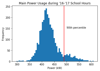
That means that df_school['Main (kW)'][df_school['Main (kW)'] < df_school['Main (kW)'].quantile(0.9)] represents the bottom 90% of the data points (by count).
We can use this to highlight days where there could be energy savings. Variation is to be expected, but if we tell a user that 90% of the time during school days it can get along just fine using less than $x$ kW of power, then it shouldn’t be a problem to reduce the power usage of days that used more.
From this it would be pretty simple to figure out what percent of the data value range lies in this count percentile, but I don’t know how relevant this information would be. The range of a sample is so arbitrary, and just 1 outlier could drastically change the range of a data set.
With a normal distribution, there’s no golden rule that 50% of the data should lie within $x\%$ of the population range, becuase the population range is $\infty$. The only standards you can apply with a normal distribution are how the percentiles compare to the mean. For example, you can say that 50% of the data should lie within $0.6745\sigma$ from the mean. But this doesn’t translate in any way to the data range.
For this reason, there’s not much more I can do on this front. Pandas already has the quantile function built in so there’s no more coding for me to do. You give it a percentage, and it tells you the corresponding value.
Back to normal distributions
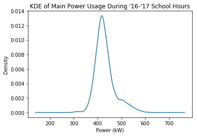
I was playing around with pandas visualization tools and came across the density plot (more specifically it is called Kernel Density Estimate). It looks very similar to the histograms I’ve been using, but instead of measuring counts of frequency it measures proportional density, and it smooths out the results into a nice curve.
It’s easier to see the shape of this distribution this way, and I think it would interesting to see if I could plot a true normal distribution against this shape. That would be a good way to refine whether my MAD calculations are actually valid.
Numpy
Pandas doesn’t have a built in way to do this, but Numpy has some tools for generating statistical data sets. I used this guide to graph a normal distribution with a custom $\mu$ and $\sigma$ value.
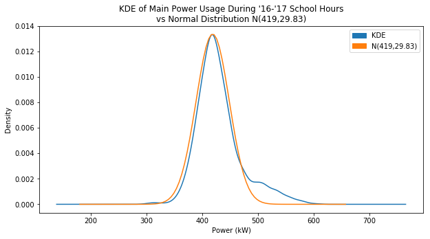
I just wanted to see how normal I could get the KDE plot to look, so through trial and error I narrowed down the values until the graphs were close to overlapping:
The larger your variance, the smaller the values of ‘density’ became, which makes sense since the data is getting spread out. The total area under the probability curve should always equal 1. I eventually set $\mu=419$ and I set the variance to 890, which translated to $\sigma \approx 29.83$
You can see on the right side how the blue KDE plot has a bulge that contrasts with the normal plot. My goal is to highlight the data that is causing that bulge.
This is a chance to see if my median and MAD calculations are working like I want them to. I manually found a pretty good estimate of the population normal distribution, so I can use those values of $\mu$ and $\sigma$ to test against.
Median
I used the median as an estimator for $\mu$.
In[173]: df_school['Main (kW)'].median()
Out[173]: 423.0857
Pretty close. Compare that to using the mean:
In[174]: df_school['Main (kW)'].mean()
Out[174]: 430.74404519261896
You can see that the median (423) is closer to my accepted value of $\mu$ (419). It’s not perfect though. The median doesn’t line up with the peak of the KDE, and I’d like to fix that later.
M.A.D.
Next, I used an adjusted MAD to estimate the value of $\sigma$.
In[175]: egz.mad(df_school['Main (kW)'])
Out[175]: 20.762

In[177]: egz.mad(df_school['Main (kW)'])*1.4826
Out[177]: 30.7817412
That’s pretty darn close. I said that $\sigma=29.83$, which is less than a kW away from my calculated value. I’m pretty happy with this, and if I adjust my center value according to the peak of the KDE and use that as my ‘median’, that could change the MAD to make my estimation of $\sigma$ even closer.
Here’s the plot using the estimated $\mu$ and $\sigma$ values I got from these calculations:
I’m surprised how close it actually is. Up until this point I was pretty much crossing my fingers that I wasn’t just pulling random numbers out of thin air. It still catches a good portion of the bulge, but it would be better if I adjusted the center point.
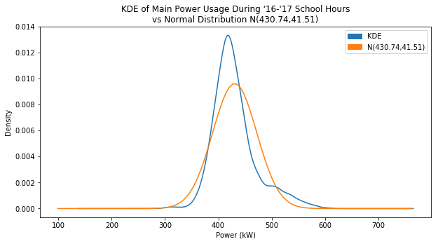
Just for fun, here’s the plot using the sample mean and standard deviation:
Much worse, right? It just goes to show why I’m not using these values, and instead using median and a scaled MAD value.


