Day 11
Jun 20, 2017 · 562 words
To start off, I’m enabling comments on the blog. Even though the site is static, it can connect to Disqus for third-party comment handling. This theme even has Disqus built in so it should be a simple matter of changing some lines in the config file.
Centering the data
It irks me is how I can’t center my rolling window when I use a time offset. One workaround (I think I mentioned this yesterday) is reindexing my data at higher detail. All of the data is at least 5 minutes apart, so I can reindex at a daterange with a frequency of '5min' and get a series at a constant frequency. Now if I want a window of 30 days I can set window=12*24*30 since there are 12 5-min intervals in an hour, 24 hours in a day, and 30 days in my window. Now that I’m using an integer based window I can set center=True.
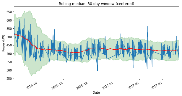
Only problem: it is really slow. I timed it at 33 seconds to run the calculations. Before this, my calculations only took a second or so to run. Alternatively, later I can try using a time offset and then manually shifting the indexes by half the window size. Here’s the output:
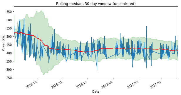
This shifts the shaded accepted region to be better fit to the power plot. What are the effects of this? Centering the window considers an equal range of data to the right and left of a sample data point. If a sudden uptrend occurs, the centered rolling median will catch on quicker to this uptrend, making the trend less likely to be flagged as abnormal.
When a positive or negative trend occurs, the uncentered MADs will be high all the way up until the end of the trend. The centered MADs will decrease as the trend approaches the end. This makes the uncentered method less likely to catch anomalies after a trend occurs. You can see this mid-way through October 2016, where the centered chart easily rejects the spike, whereas the uncentered one almost lets it slide.
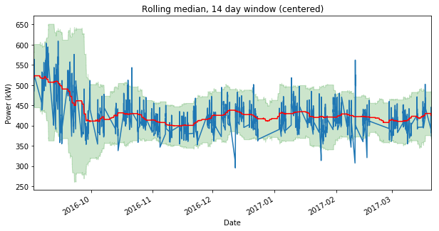
I exported a few larger plots to compare the effects of centering as well as using a 14 day vs 30 day window size. Pick your favorite:
I haven’t decided yet which is the best option. If centering is best, I’ll want to work on a more efficient way to do the calculation. In the meantime I’ll work on something else to clear my mind.
Temperature Data
Besides building occupancy, another factor that can affect power usage is temperature. It would be handy to be able to fill our dataframe with outside temperature data and see if the correlates to the power usage.
Many of the popular weather providers have an API, however their services are limited at the free tier. You can make a limited number of requests, and you can’t really pull historical data (which is exclusively what I need).
The NOAA website has a bulky tool for downloading historical weather data, but for Andover it only seemed to have precipitation data, not temperature. The closest station with air temperature data is in Lawrence just North of Andover, so that will have to do.
I submitted a data request for the same dates as the sample power data (7/30/15 - 3/20/17). Now I just have to wait to get an email response with the output file.


